The scale of neutrals: where to place yourself
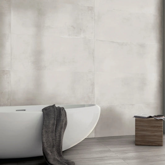
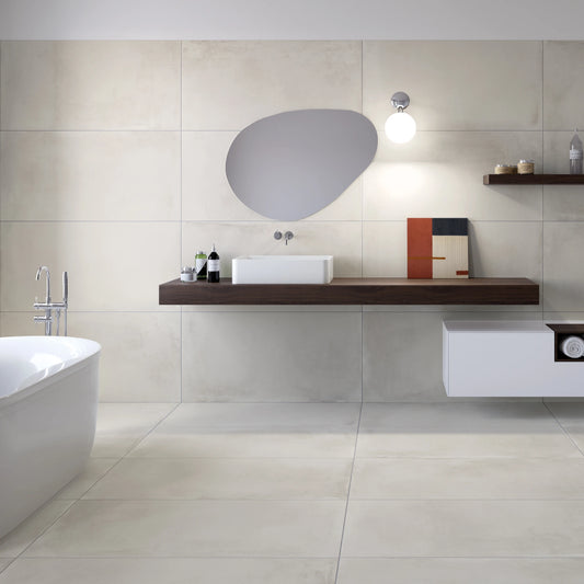
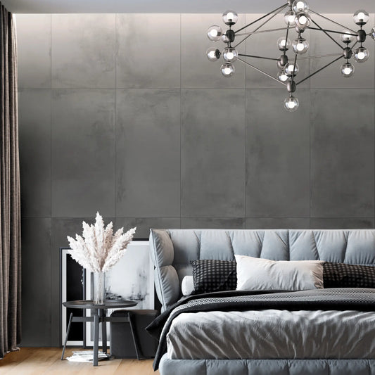
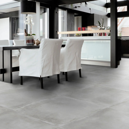
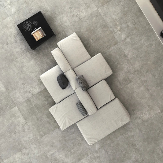
With concrete-effect tiles the decision is not about colour but about the depth of the tone, because the whole range stays neutral and only changes how much light it absorbs. On the cool side the scale starts at white and runs through light grey, mid grey and dark grey: the further down you go, the more the floor draws the perimeter of the room and supports pale furniture; the further up, the more the surface steps back and leaves room for everything else.
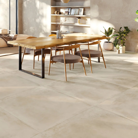
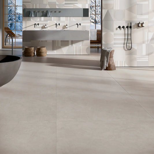
The warm side — sand, beige and taupe — does the same job at a different temperature: it softens volumes and compensates for rooms with little natural light, where a full grey would look flat. Outside the neutral range there are only two tones, a sage green and a dusty blue, intended for walls more than for floors. On how concrete came to hold its place in contemporary interiors we have written a complete guide.
A floor that acts as a background
What sets concrete-look tiles apart from the other effects is that they do not compete with the furniture. Marble and stone bring a pattern that asks for attention; concrete brings an even surface, and that is why it pairs across very different materials without anything clashing.
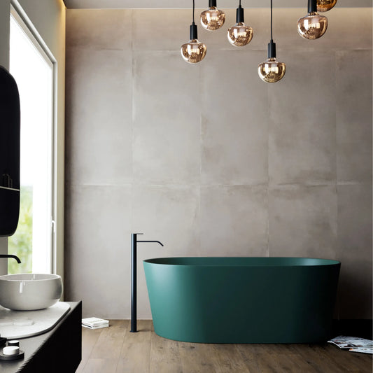
The practical rule runs through temperature. Greys hold up well next to metal, glass and matt lacquer, and they are the most frequent choice in sharply drawn interiors. The warm neutrals work better with natural materials: the most recurrent combination in contemporary schemes is with wood-effect porcelain tiles, where the concrete acts as the neutral plane and the wood brings the warm note, often separating the living area from the sleeping area.
Six sizes and the continuous surface
Concrete is the effect that finds its best expression in the large format tiles, because the continuous surface is exactly what the original material evokes. On 120x120 the floor reads as a single plane, and with the grout line kept to a minimum the modular grid almost disappears. 60x120 keeps much of that effect with a simpler installation, while 90x90, 80x80 and 60x60 remain a balanced compromise for medium-sized rooms or for layouts with many perimeter cuts.
30x60 is the wall size, and it is the one on which the less neutral tones do their best work: on a wall the cement surface carries the colour without weighing it down, which is not always the case on a floor.
Each size has its own section where all the effects sit together: 120x120 porcelain tiles, 60x120 porcelain tiles and 60x60 porcelain tiles.
Frequently asked questions
What sizes do concrete-effect tiles come in?
Six: 30x60, 60x60, 60x120, 80x80, 90x90 and 120x120. Most tones are available in more than one size, so floor and wall can be coordinated on the same surface.
Do concrete-effect tiles only come in grey?
No. The cool scale runs from white to dark grey, and alongside it there is a warm range of sand, beige and taupe. There are also two tones outside the neutrals, a sage green and a dusty blue.
Can they be used on walls too?
Yes. 30x60 is the size designed for vertical laying, but the large rectangles are used on walls as well, particularly in bathrooms to coordinate floor and wall in the same tone.